LK Visual Identity
LK is the art and research arm of Solk Architecture, a space for creative exploration beyond the boundaries of client-driven work.
LK comes from the name Leah Kiren and also pays homage to the artist Lee, Krasner, who often signed her paintings LK in an effort to remove (her) gender from the viewer's experience of her work. Both LK and Solk Architecture search for ways to present work in a shared, neutral space, free from traditional gender constructs.
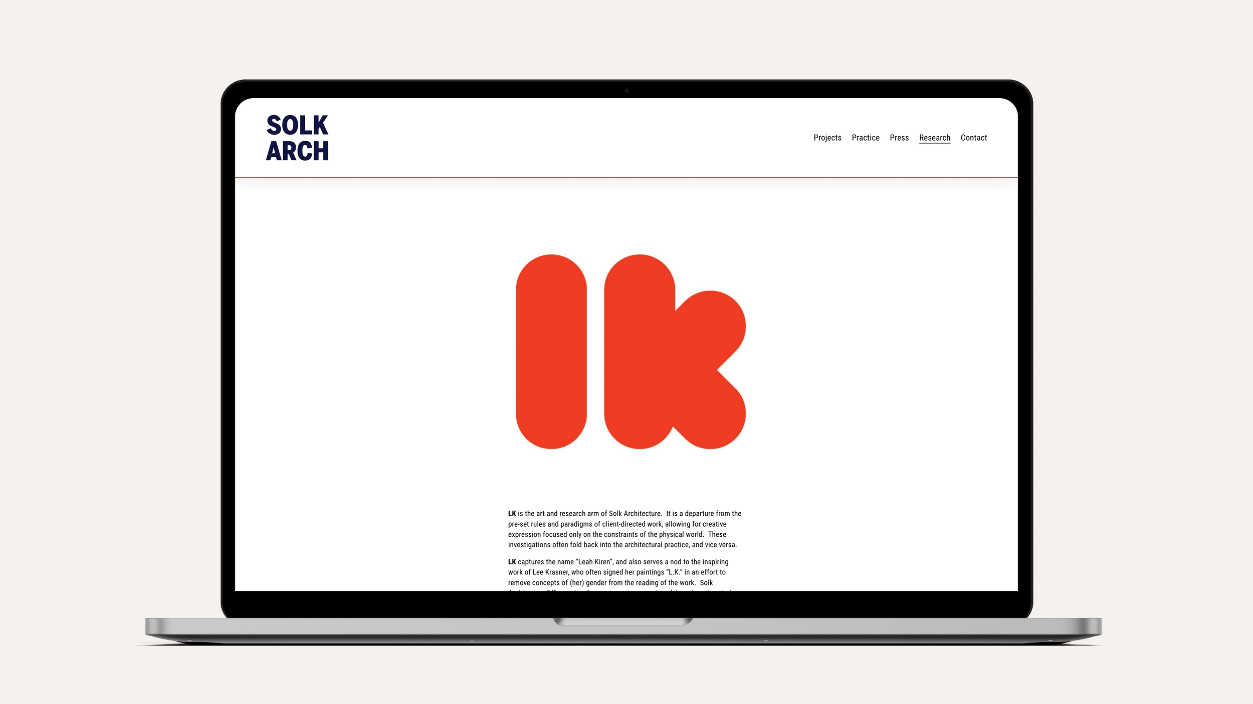
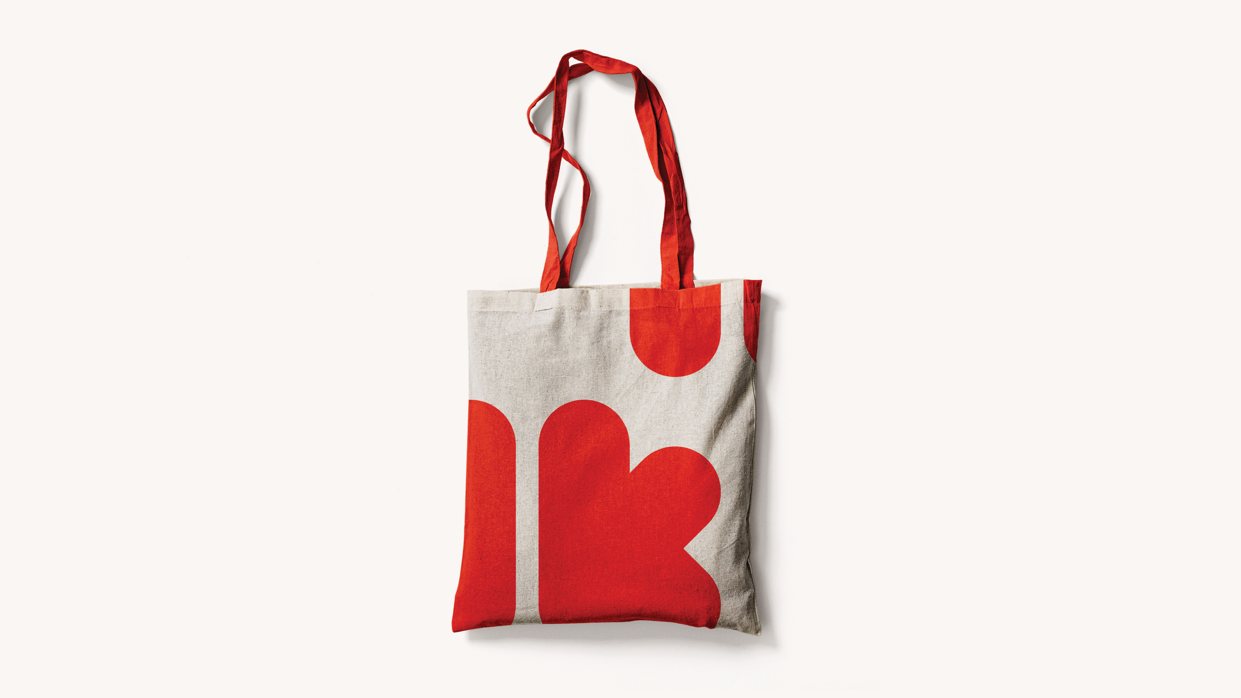
The LK logo reflects this philosophy of balance and neutrality. It blends masculine and feminine elements; the bold primary colors and rigid geometry are softened by rounded forms and lowercase letters. The square form and red color reference an “artist chop” or the East Asian mark used to sign and authenticate artwork. As with LK itself, the logo serves as a symbolic expression of identity.
Work with LK included branding and identity development, creative direction, design systems, logo design, typographic design, and website design.
May 2025


© Amanda Bowers Wong 2026